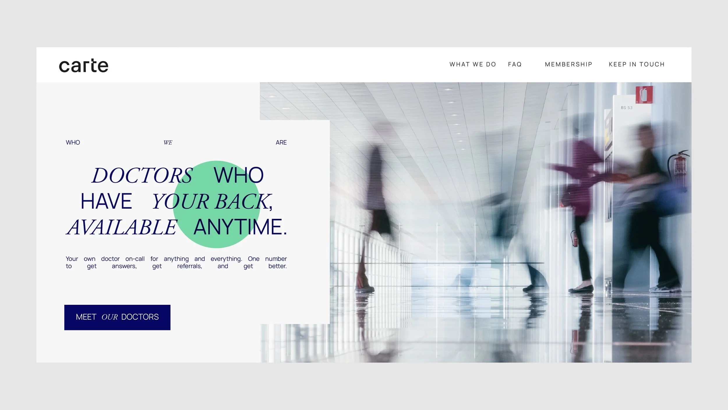
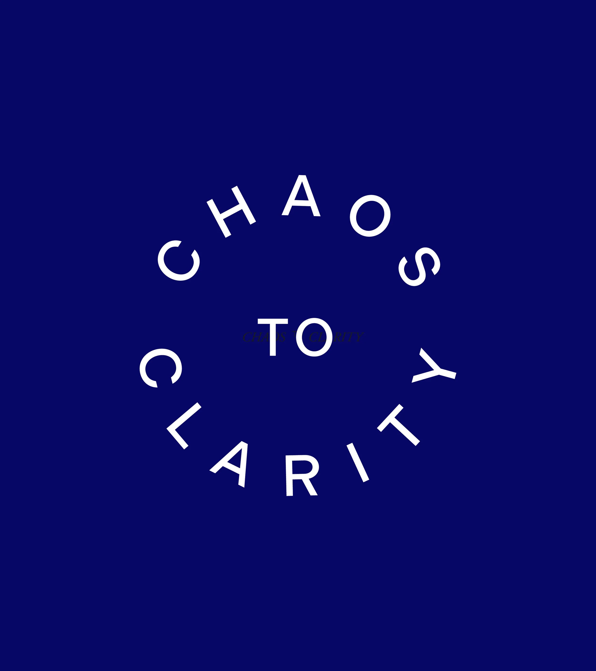
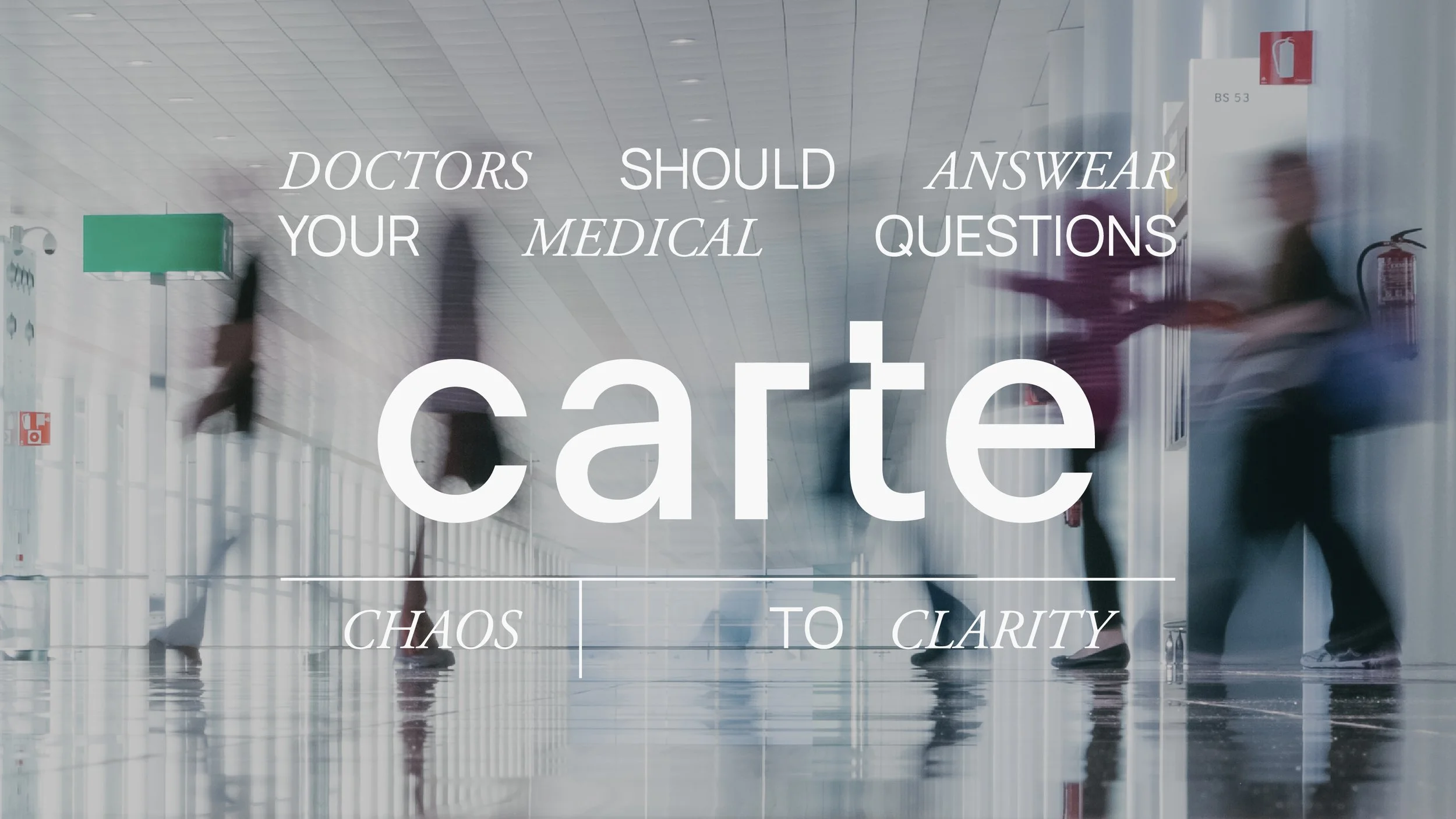
From chaos to clarity
-
A visual identity that reflects Carte’s mission: bringing calm and order to the chaos of the medical experience. The design combines simplicity and sophistication to convey trust, accessibility, and well-being. Typography, color, and symbols reinforce clarity as a core value, supporting CARTE’s vision of integral and human-centered healthcare.
Client:
Carte Clinics
Services:
Brand Identity